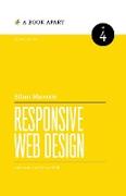
Responsive Web Design
BücherAngebote / Angebote:
Since its groundbreaking release in 2011, Responsive Web Design remains a fundamental resource for anyone working on the web.
Learn how to think beyond the desktop, and craft designs that respond to your users' needs. In the second edition, Ethan Marcotte expands on the design principles behind fluid grids, flexible images, and media queries. Through new examples and updated facts and figures, you'll learn how to deliver a quality experience, no matter how large or small the display.
WHAT'S NEW IN THE SECOND EDITION?
Discover new tips and tricks for browser support, take a closer look at solutions for serving images, explore the role of progressive enhancement in web design, find better methods for managing bandwidth, and more. Follow along with the new examples and approaches Ethan has assembled, and dive in to his meticulously revised code samples.
Folgt in ca. 10 Arbeitstagen


