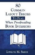
80 Common Layout Errors to Flag When Proofreading Book Interiors
BücherAngebote / Angebote:
WHAT THE PROFESSIONALS ARE SAYING ABOUT "80 COMMON LAYOUT ERRORS": * GRAPHIC DESIGNER Victoria Vinton (CoyotePressGraphics.com) writes, "This is a great resource. In it you mention so many things that I need to beat clients over the head with because they don't believe me. I'll use your book to validate my advice to clients!" * EDITOR AND PROOFREADER Judy Vorfeld (EditingAndWritingServices.com) writes, "This eBook is amazing. I am doing a great deal of formatting these days, and your words resonate with me. I have encountered many of the issues you mention, and plan to buy the book and keep it handy so I can help my clients by providing the best possible proofreading and formatting. Thank you for understanding what we experience and then providing the tools to improve... and at a very reasonable cost. * INTERNATIONAL BESTSELLING AUTHOR Robert Wolff (RobertWolff.com) writes, "Lynette Smith is a gifted publishing professional who not only is a superb copyeditor but has the keen eyes and instinct to make any project even better. Follow her advice and common sense rules and it will raise your skills, abilities, and publishing projects up a huge level. Highly recommended!" WHEN YOU USE THIS GUIDE, YOUR BOOKS WILL LOOK MORE PROFESSIONAL: Small publishers, indie publishers, self-published authors, professional proofreaders, and proofreaders-in-training will prevent embarrassing layout errors and publish more professional-looking printed books with this handy guide! Listing the 80 most common types of layout errors found in a book interior (PDF layout or printed proof copy), each numbered entry shows the type of error, cites the layout rule, if any, and then mentions the most common options, in general terms, that the layout professional may choose from to correct the error. Error types are grouped within the these categories: Page Margins, Headings and Subheadings, Body Text, Block Quotations, Numbered and Bulleted Lists, Widows and Orphans, End-of-Line (EOL) Hyphenations, Tables, Figures, Including Photos, Blank Pages, Repeating Headers and Footers, Including Pagination, and Contents Listing. Also included is a handy key to point sizes and their height equivalents in inches, centimeters, and lines. HOW A SAMPLE LISTING LOOKS: "INCONSISTENT WHITE SPACE ABOVE AND BELOW CHAPTER HEADINGS. All new chapters and equivalent major headings should begin the same distance from the top margin. The designer usually begins the chapter heading an inch (72 points) or two (144 points) below the top margin and might insert about 0.25" (18 points) of vertical white space below the chapter title." WHY YOU'LL WANT TO GET THIS BOOK NOW: Authors have done their best. Editors have done their best. Book layout artists have done their best. But SOMEBODY qualified needs to check that layout to prevent problems before the book goes to print. Download and read this guide, and THAT SOMEBODY WILL BE YOU.
Folgt in ca. 15 Arbeitstagen


